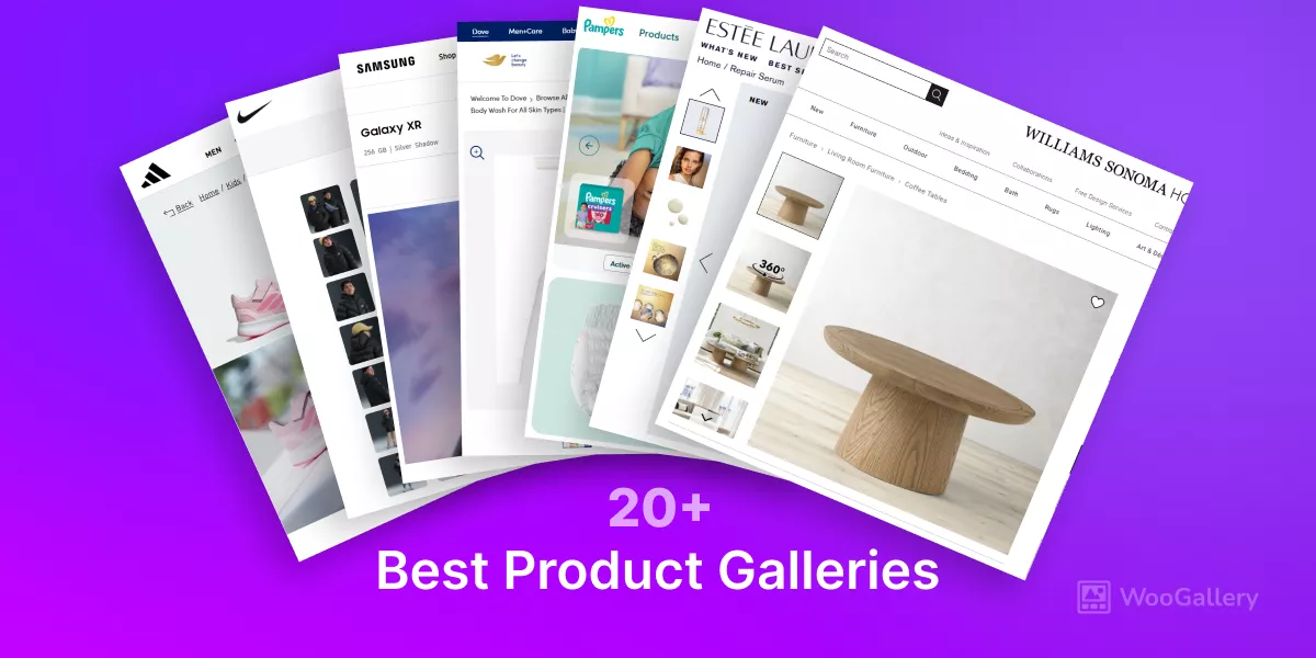
In this blog, I’ll display and discuss the best product gallery examples from the World’s top brands.

If you have an online store (selling any type of products) and want to upgrade your typical product galleries into brand-level product displays, these examples will help you a lot.
Strategic, modern, and interactive product galleries can incredibly boost sales.
Let’s explore.
The World’s Top Inspiring Product Galleries
Explore the world’s best product galleries for valuable ideas and inspiration to upgrade your own and accelerate the sales growth.
Chanel Product Gallery
Chanel is the world’s No. 1 fashion brand. It uses multiple product gallery styles. The most used gallery style on its product pages is as follows.
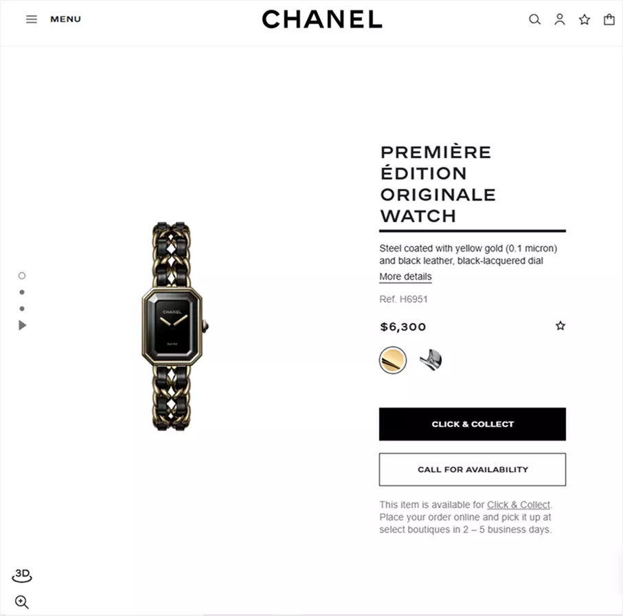
This is the anchor navigation product gallery. This product gallery layout is the most popular product gallery style. Many more prominent brands use this product gallery layout.
Louis Vuitton Product Gallery
Louis Vuitton is a famous fashion brand for luxury garments, bags, footwear, watches, jewelry, and more. It uses a unique product gallery layout as seen below.
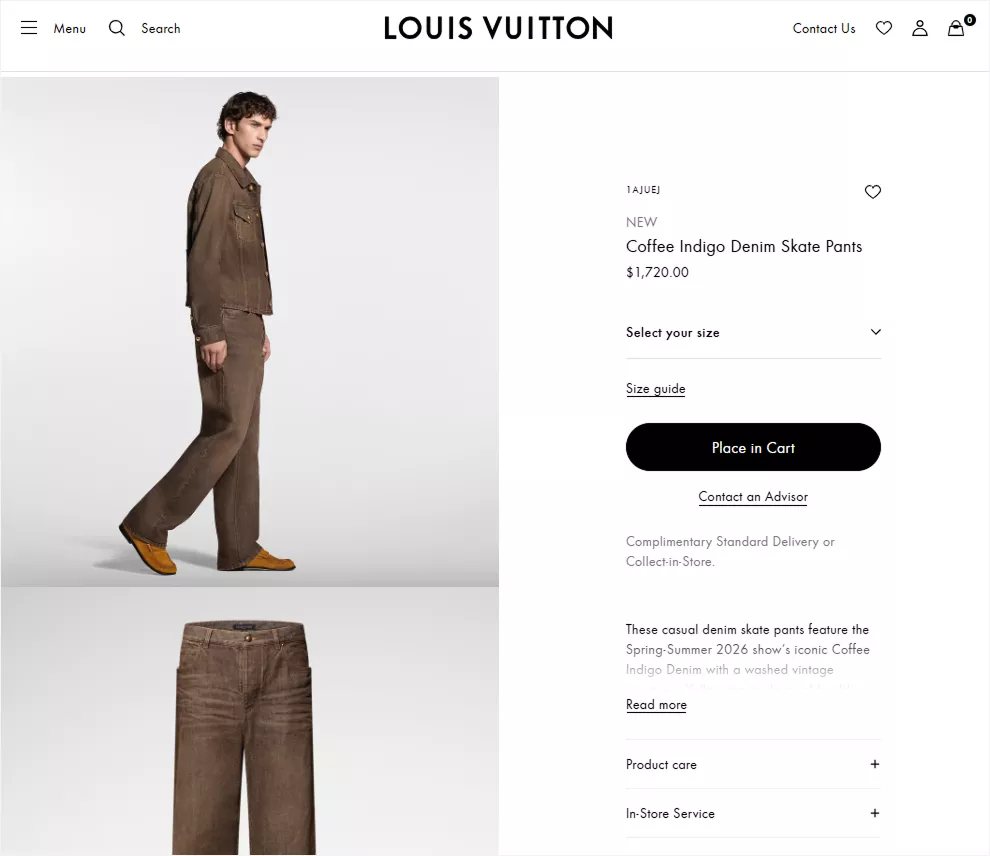
Although it looks a lot like the previous one, it’s basically wider and more visible as it has no anchor navigation.
Nike Product Gallery
Nike is one of the most popular fashion brands. It uses multiple product gallery styles. One of the most used gallery styles is as follows.
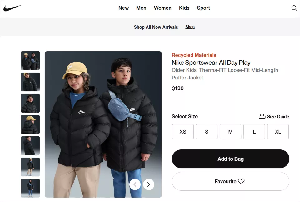
This is a vertical thumbnail slider product gallery. This product gallery layout is the most popular product gallery style. You will find this layout to be used on many more brands’ product pages.
Hermes Product Gallery
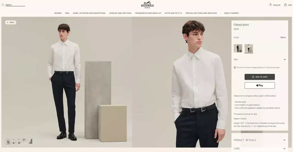
Hermes prefers a full-width product thumbnail slider gallery. It places the thumbnails at the bottom left and the product’s basic information at the bottom right. Hermes’s product gallery is minimal, elegant, bold, and visually forward.
Adidas Product Gallery
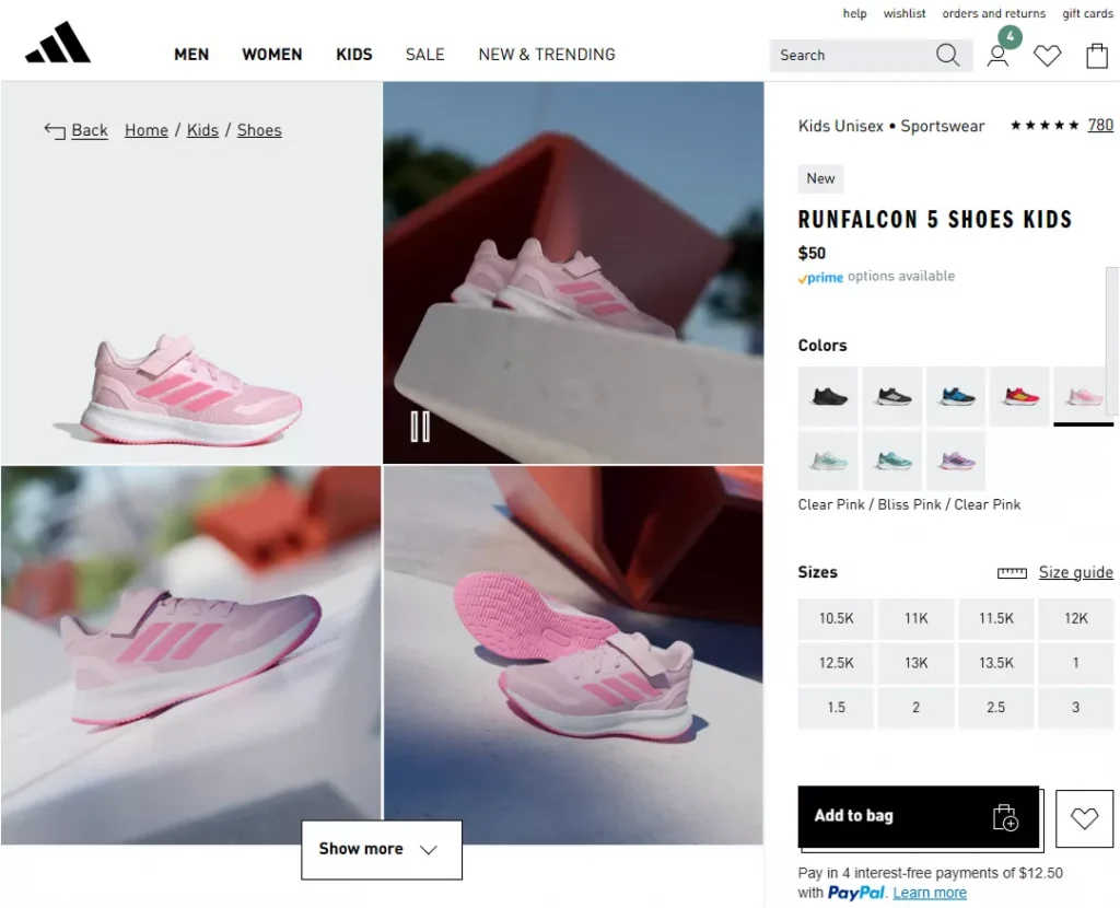
The Adidas product gallery stands out with a modern 2-column grid layout that seamlessly combines high-quality images and videos to showcase products in real-life contexts. This immersive layout allows shoppers to quickly scan visuals, understand product details, and feel confident in their purchase decision– all without overwhelming the page.
By balancing strong visual storytelling with intuitive interaction, the gallery feels clean, user-friendly, and premium, making it easy for customers to explore colors, angles, and use cases while staying focused on conversion.
Most interestingly, WooCommerce stores can use most of the product galleries with ready layouts and simple customizations by WooGallery.
Brilliant Earth Product Gallery
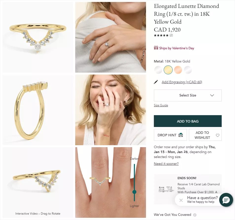
The Brilliant Earth product gallery follows a grid-based layout similar to Adidas. However, it uses a bit more grid space and keeps all the product gallery images visible. Visitors don’t have to click the Load More button to view product images.
The excellent thing about the Brilliant Earth product gallery is its interactive experience. The built-in 360° product video lets users rotate the jewelry for a realistic, in-hand view, while the skin-tone contrast tool helps customers visualize how the piece looks on different skin tones. These advanced features significantly reduce uncertainty and increase purchase confidence.
Cartier Product Gallery
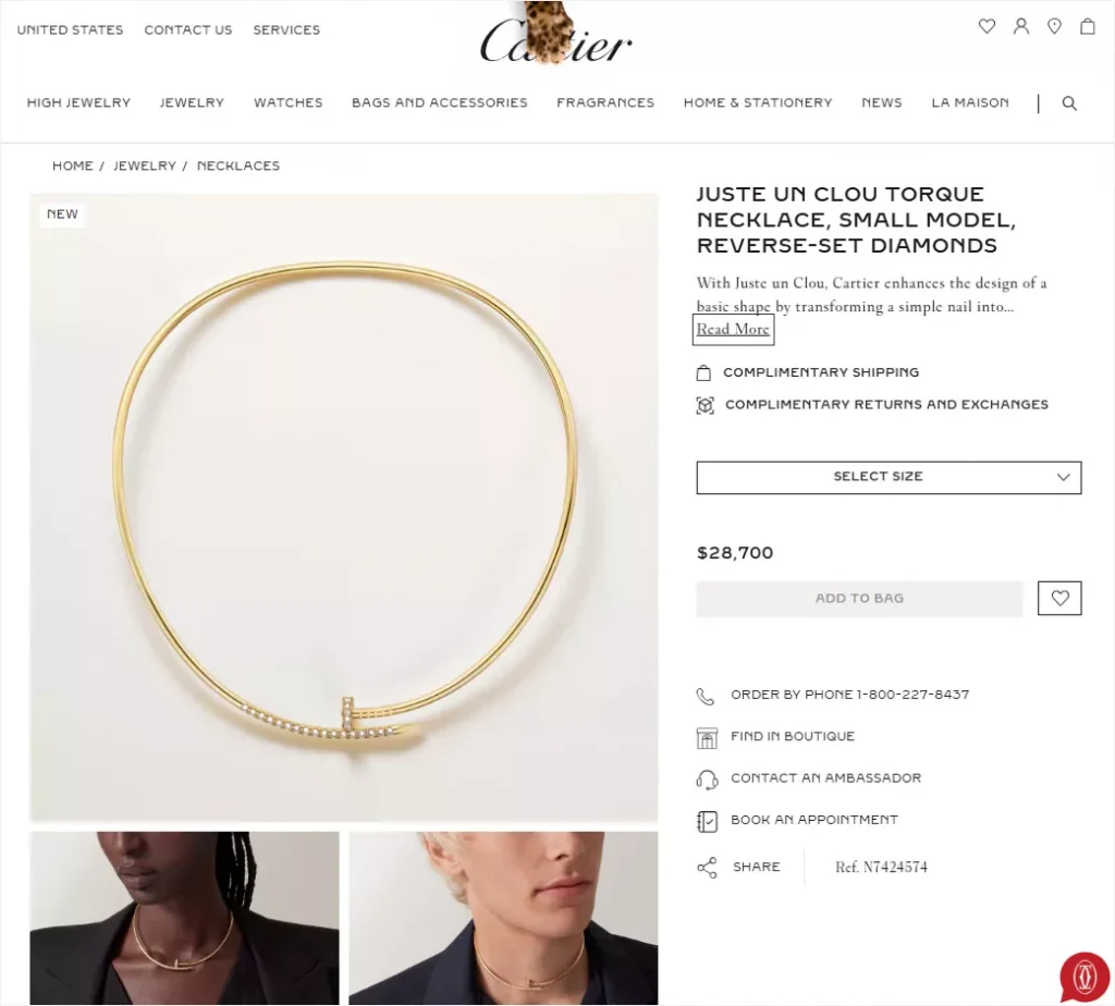
The Cartier Product Gallery uses the hierarchy product gallery layout. It showcases the large product image first, then the small product images to keep visitors’ focus on the main images and allow exploring additional images too.
It’s also a modern product gallery trend. It uses multiple sizes of images to skip monotony and focus on the main image.
Harry Winston Product Gallery
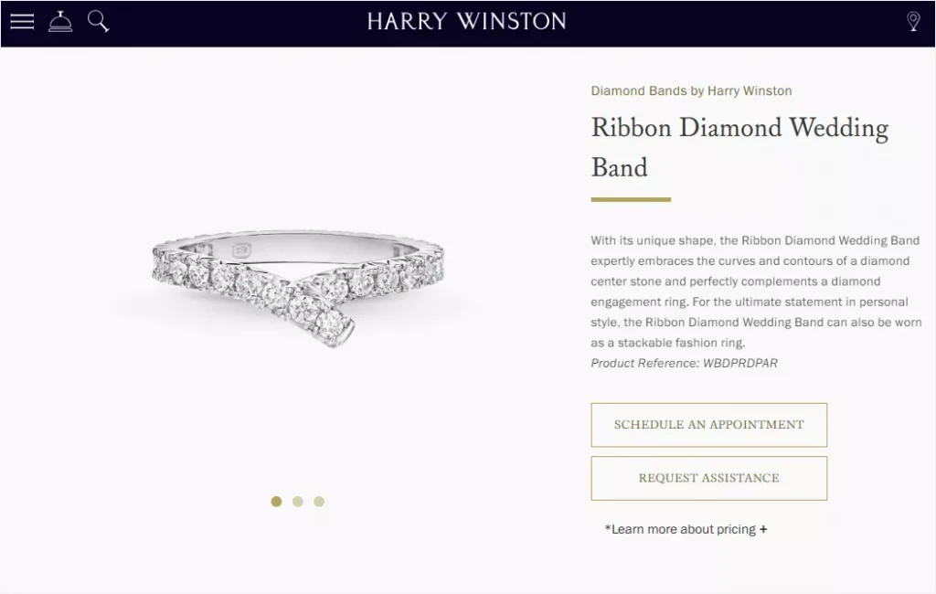
The Harry Winston product gallery uses a simple and clean product gallery layout. It uses a product gallery slider layout with simple pagination dots– nothing else.
This renowned brand believes that sometimes less is more– simplicity and minimalism create greater impact, effectiveness, and beauty than complexity or excess.
Bose Product Gallery
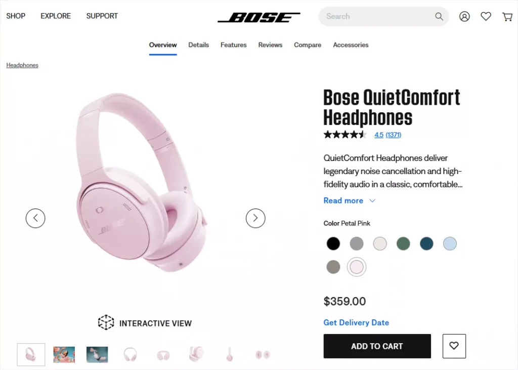
The Bose product gallery prefers the thumbnail bottom gallery slider layout. It also includes an interactive 3D view option and clear arrow navigation. Its thumbnails are small and minimalistic.
Logitech Product Gallery
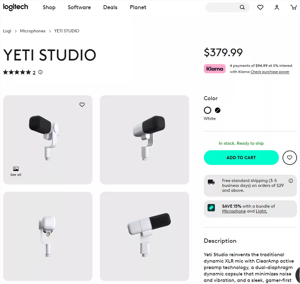
The Logitech uses the 2-column grid product gallery layout with sufficient inner spaces. You can compare with the Adidas product Gallery. Its product gallery style is clean, bold, and visually appealing.
Apple Product Gallery
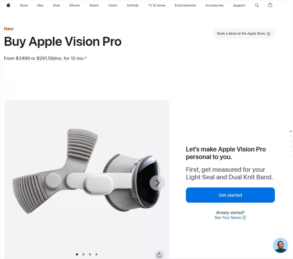
Apple uses multiple product gallery styles. The most used product gallery style of Apple is a product gallery slider layout with no thumbnails. It uses pagination dots and navigation arrows.
Samsung Product Gallery
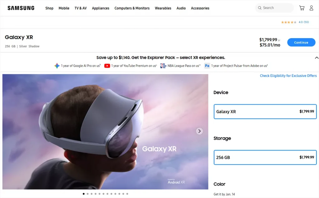
The Samsung product galleries look like Apple’s. It uses the simple product gallery slider layout with pagination dots and arrows– nothing else. However, it uses wider product galleries to provide a larger product image viewing experience.
Pampers Product Gallery
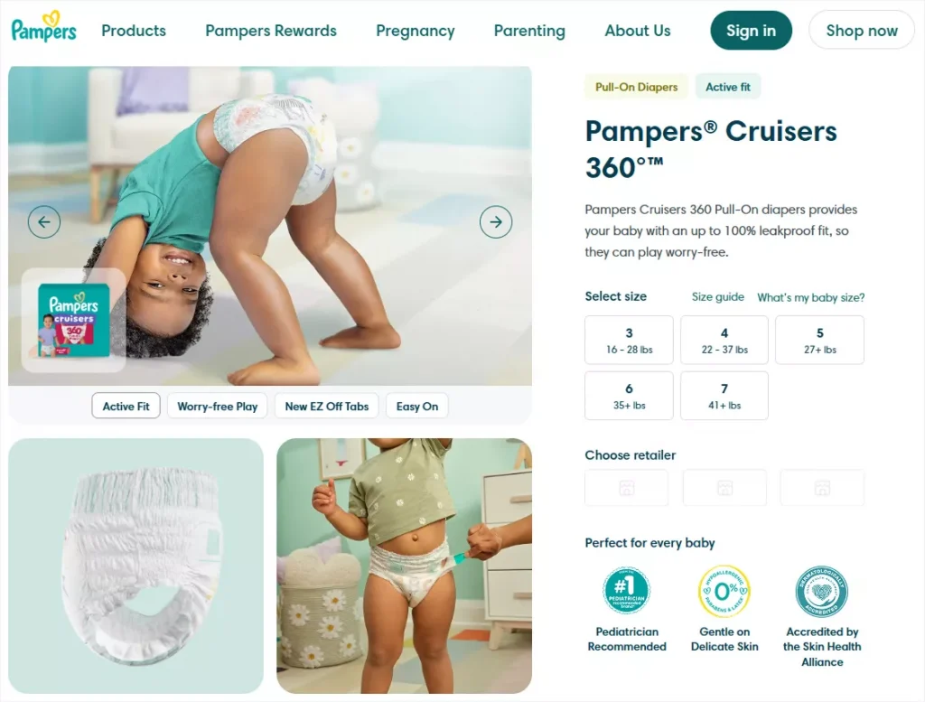
The renowned baby product brand Pampers uses the hierarchy grid for its product galleries. It offers simple arrow navigation on the first product gallery image.
Williams Sonoma Product Gallery
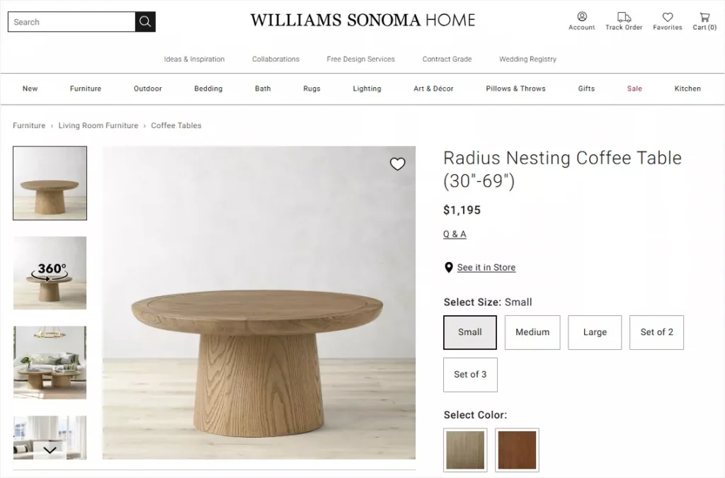
One of the leading home décor brands, Williams Sonoma, uses a left-aligned thumbnail product gallery layout. At the same time, I found that many home decor brands use multiple product gallery styles– using left-side thumbnails for taller products and bottom-aligned thumbnails for products with a landscape orientation.
What product gallery styles do you like most? Do you need any customizations to your favorite product gallery?
The great thing is that WooCommerce shops can use most of the product galleries above with ready layouts and easy customizations by WooGallery.
Leave a Reply